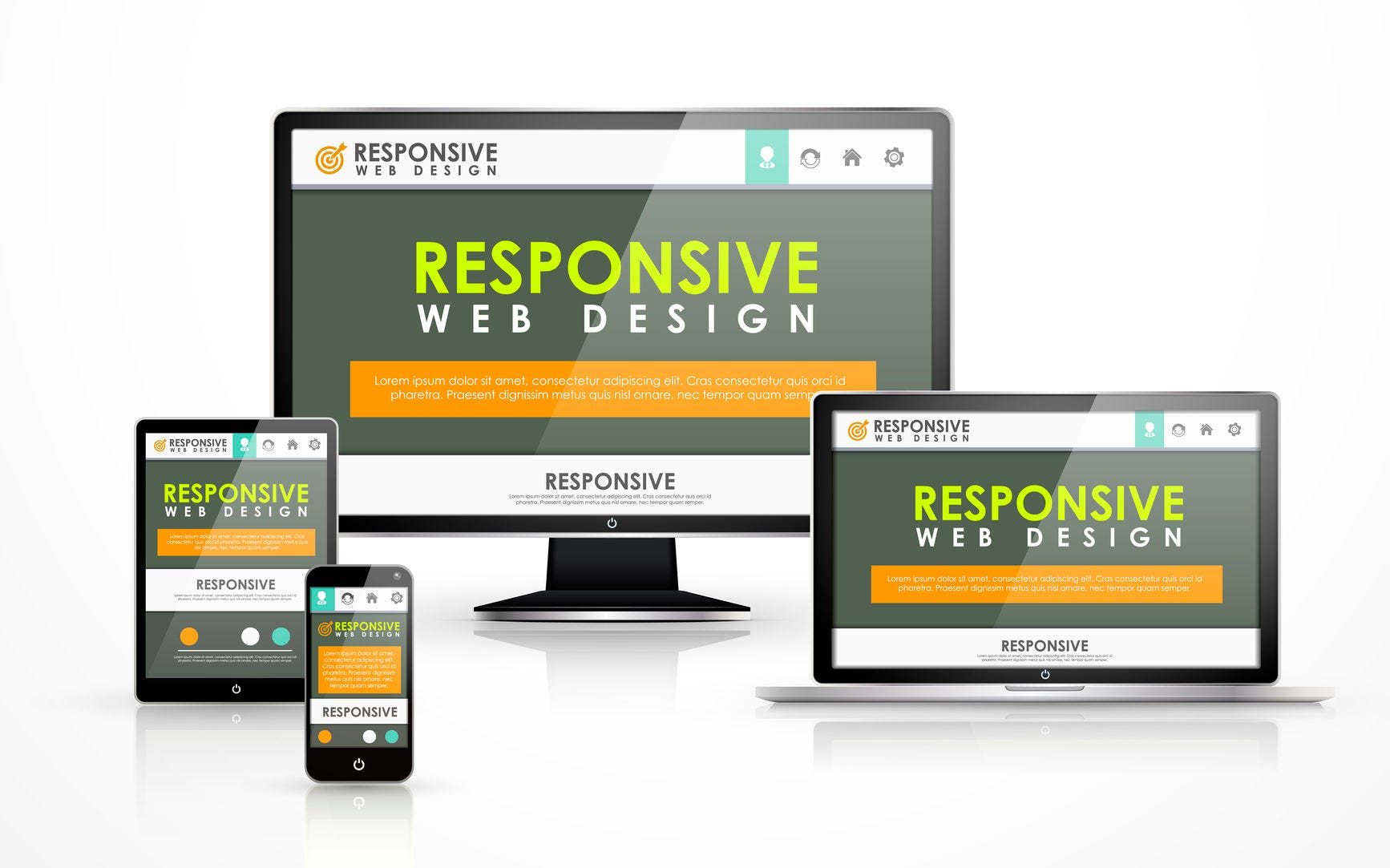
Image credits to Bradley Nice @ https://medium.com/level-up-web/best-practices-of-responsive-web-design-6da8578f65c4
A responsive web design is about using HTML and CSS to produce flexible designs for any devices like desktops, laptops, tablets and smartphones by restructuring its design through resizing, hiding shrinking or enlarging a web element or content it is much like the word “one design fits all” in a different manner.
Responsive design is normally design through CSS, setting each element’s width, height and other attributes mostly with percentage in relation to the device’s screen resolution.
Tutorial and example can be found at https://www.w3schools.com/html/html_responsive.asp
Although this is all for education, learning from scratch on how to build a responsive design is not always the best option. A student should learn how to utilize modern resources which will be more relevant in the market or real world application of being a web developer.
In this case, I am recommending the class to use WordPress Content Management System (CMS). A content management system is an application offering vast functionality and tools to web developers around the world to produce quality webpages in a matter of time meeting the clients deadline. It is a tool mostly packed with ready to add elements or contents like tables, comment sections, file uploads, displays and other important sections of a webpage.
To download and install WordPress follow this link
Download: https://wordpress.org/download/ take note on the requirements needed
Installation Guide: https://wordpress.org/support/article/how-to-install-wordpress/
Activity:
After downloading and installing WordPress download and use a responsive blog theme from this link https://wordpress.com/themes/blog/free create primary content about anything or about yourself and upload the files into your 000webhost.com free account for me to check your progress.


No comments:
Post a Comment